UNE Chinese Calligraphy Showcase 2021
The following images are the work of students in the CHIN211 Chinese Calligraphy unit collected from 2017, 2019 and 2021.
To find out more about the images in this gallery, the names of the students who created them, and their reflections, see below. They are listed in the same order as they appear in the gallery.


Student Reflections
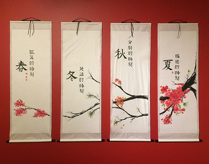
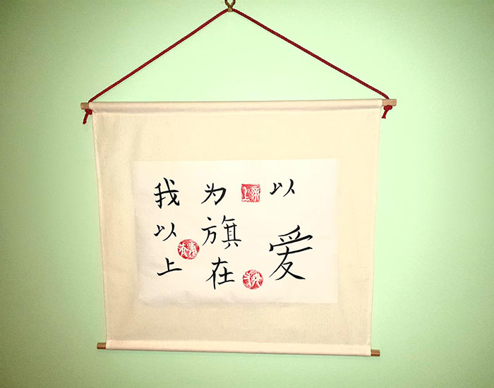
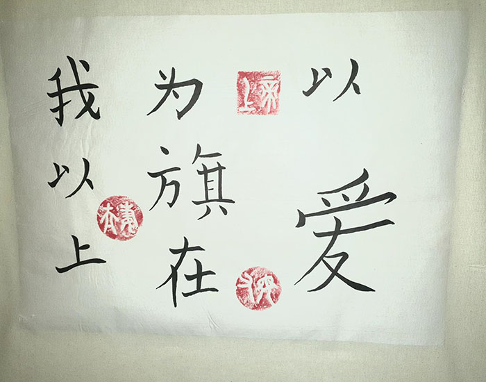
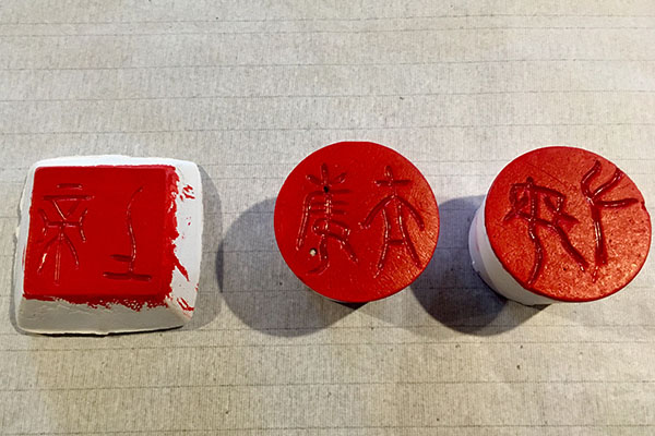
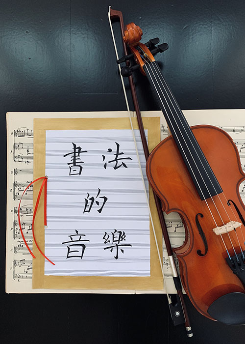
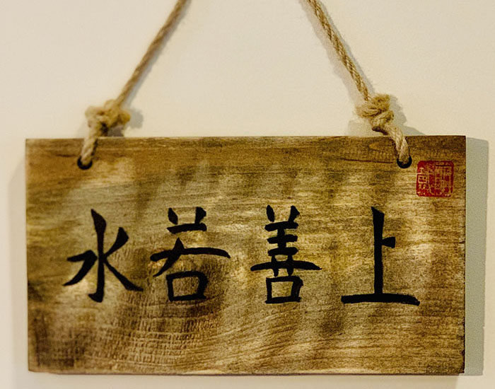
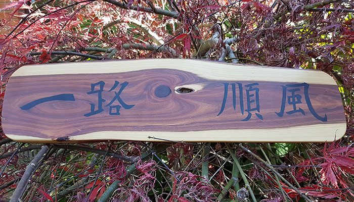
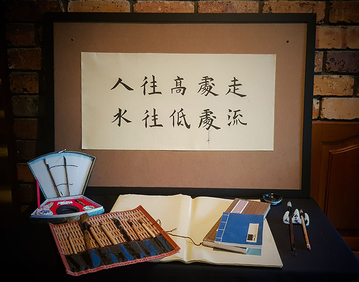
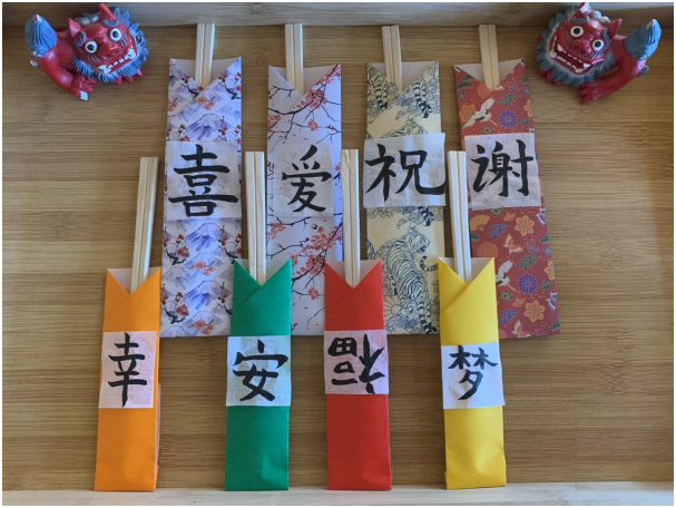
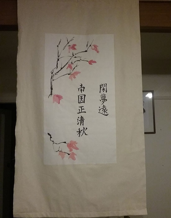
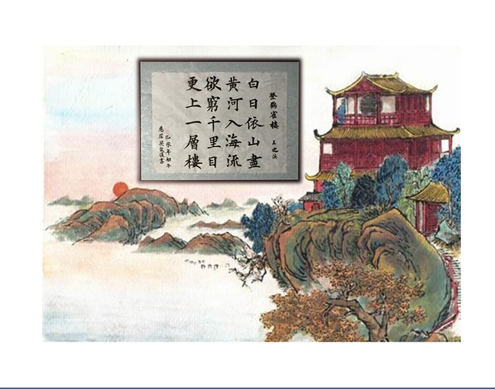
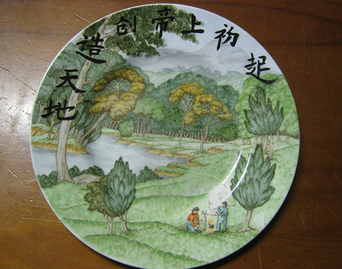
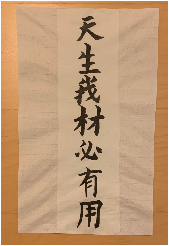
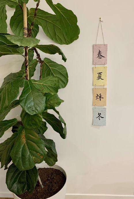
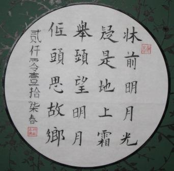
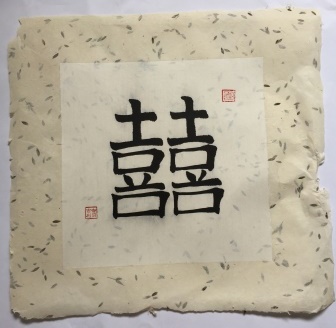
For Every Moment There Is A Season Inspired by the seasons, each scroll signifies one season, represented through the changing blossom and pine trees and a short phrase related to the season. Summer - the moment of embracing , Autumn – separate moments, Winter – a moment to cry, Spring – the moment of laughter. When creating my work, I wanted to design the scrolls so they could be displayed as a whole or separately throughout the year. To achieve this, I focused on balancing the design of the calligraphy to ensure the scrolls balanced together and separately. It was initially difficult to work with the rice paper as it was absorbing the calligraphy ink much faster, making the edges unclear, so the ink needed to be the correct consistency before writing the characters on the final work and I also couldn’t use too much ink for the calligraphy. To ensure the shape and location of the characters were correct I used a grid under the rice paper. Each scroll is wet mounted with a rice paper backing which I did after the scrolls dried for a day. When doing the wet mounting there were a few difficulties, including the ink running when brushing on the paste and mounting the scrolls without creases or wrinkles. As the ink smudged when I brushed on the paste I was unable to make sure the paste was as smooth and even as I would have liked before applying the backing which meant I had some creases and bubbles. While I had some difficulties with the mounting I feel that some more practice and allowing the ink to dry longer would improve the wet mounting. Reflection My exhibition piece is a bible verse, from Song of Songs, Chapter 2 vs 4. The Song of Songs is a love song between God and his people. The banner is a representation of the protection of God’s love and I am comforted and safe under it. I added 3 seals. The first seal, shàng dì, represents God as the author and original owner of the verse. The second, fù mu, represents the ownership my parents had of this verse. Their banner over me was love. The third seal, fù qi, represents husband and wife. My husband and I took ownership of the verse when we married. His banner over me is love and mine over him. Methodology I poured Plaster of Paris into 3 moulds and left it to set overnight. I then carved Seal script into the plaster and sealed it, with 2 layers of the acrylic ink, before use. I then made a banner from Calico and attached my calligraphy with vliesofix (an iron on adhesive, used to fix fabric to fabric). I made the character for love more prominent because, of course, love is the most important thing of all. The Music of Calligraphy Against the background of a career as a musician and music educator, when I began studying calligraphy a few months ago I was quickly struck by the similarities between the execution of the disciplines of music and calligraphy. Creating each stroke of the brush reminded me of creating a musical performance - the intense concentration required to seek perfection at every attempt; the overwhelming sense that however good the outcome, it was never good enough; and the long hours of solitary concentrated practice required to master even the most basic technical passages. A little investigation confirmed that I am certainly not the first person to observe and experience this correlation. For example, in his seminal work on the disciplines, philosophies and techniques of calligraphy in Imperial China, Jean Francois Billeter (2010) notes a number of analogies between music and calligraphy, including the use of an “instrument” to create the art of interpretation (for example, a brush, and a violin bow), the unforgiving act of creating a brush stroke or sounding a note that is impossible to retract once executed, and the parallel between the three “moments” of creating a brush stroke or a musical note - attack, development and ending. The aim of this final project is to attempt to visually capture this intersection. For my final project, I wanted to create something that I could hang in my home for two reasons. Firstly, I wanted to be able to remind myself of the time I spent learning Chinese calligraphy, and secondly, I wanted to be able to use it as a talking point when guests visit our home. At first, I was unsure about how to do calligraphy on timber so I practiced on numerous different types of timber and surfaces, and I also tried using different mediums including acrylic paint, ink, and a mixture of the two. I found that by using acrylic paints, the effect was much different than using ink, so I used ink and the same calligraphy brush used on paper. I prepared the surface of the timber with sandpaper so that it was porous enough to absorb the ink, but fine enough not to allow the ink to run too much. I practiced the four characters on paper before writing on the timber. After writing the characters on the timber, some areas needed to be re-done as the ink was not always equally black. I also used my stamp on the top right corner to give it an authentic look. After allowing the ink to dry, I applied thee coats of varnish (透明的漆 😃) to protect the timber and the surface. I chose an idiom that reflected a meaning that I embrace in my own personal life and wanted to convey to others. I did not previously know this idiom, but after searching for a suitable one, I came across it and felt that it was extremely appropriate for what I wanted. I also wanted an idiom that was not too common, so as to add a feel of profundity. For my final artwork i chose to paint the idiom 一路顺风. I lived and worked in China for 5 years and diligently studied Chinese during my time there. My first teacher was the wife of my Chinese boss and this was the first idiom that i ever learnt. Interestingly enough it was also the last thing that my boss said to me when he dropped me off at the airport to fly home. It has a special place in my heart. The uncomplicated nature of the characters also appealed to me as sometimes there is real beauty in simplicity. Each individual stroke is crucial in simple characters. My home is full of timber so I thought that a timber sign on the back of my front door was a perfect way to bid farewell to guests. I have a friend that owns a local timber mill, so i had him slab me a piece of Mulga from a log i had in my yard. Mulga is incredibly slow growing wattle that is dense and very colourful. I cut it to size, rounded the edges then sanded it back using ascending grits to close the grain on the timber. I used polyurethane to completely seal the pores of the timber. I created a practice piece of timber to adjust to the feel of the brush on the sealed timber as it’s completely different to rice paper. I used my calligraphy brush with black acrylic paint to produce the characters. The thickness of the paint was quite an issue and it was difficult to produce clean strokes but with much effort I feel I achieved nice characters. I drew a grid in lead pencil as a guide to ensure the characters were correctly positioned and balanced. 人往高处走,水往低处流 is a Chinese idiomatic phrase that translates literally to ‘people walk to toward the highest point, water flows toward the lowest point.’ In a less literal sense, it means that one seeks their way up just as water seeks a way down, and is used in the sense that one should always be striving to make continuous progress. I feel like this phrase is representative of my attitude to many things I pursue, but definitely in regard to Chinese calligraphy. I have some of the practice sheets left over from our first intensive school and I found it amazing how much I actually improved over the course of the semester. In this piece of work all the characters were modelled off the work of Tian YingZhang, where the majority are from his version of the Thousand Character Classic. I decided to take on the challenge of wet mounting it and was pleasantly surprised when it only took me a few testers to get the hang of it. When doing this final piece, I was quite stressed while gluing it as I didn't want to ruin the fact that I’d managed to get all the characters looking good on a single sheet. The only issue I had was one rogue ink streak, but I decided to run with it as I felt like it fits with the sentiment of the phrase. Next time I’ll strive to do it better! Since food is essential for our lives, my idea for this Chinese calligraphy art is something for food. I am originally from Japan and I believe that there are some similarities between Chinese and Japanese cultures therefore I mixed both cultures for my work. Also I really enjoyed the Chinese food when I went to Xi’an last year. Firstly, I created 8 chopsticks cases with using origami. Number 8 is the luckiest number in China. It contains meanings of prosperity, success and high social status. Secondly, I chose 4 colours of red, orange, yellow and green. Red represents fire and is the most popular colour in China, meaning for happiness, success and good fortune. Orange is a symbol of good luck, yellow is for royalty and power of the throne, and green is money for wealth. I also chose another 4 designed with animals and floral origami paper which I believe that would be suitable symbols for celebrations or good luck in China and Japan. Finally, I chose the Chinese characters of 樂,爱,安,梦,谢, 幸,福,喜. 樂 for enjoyment, 爱 for love, 安 for peace, 梦 for dream, 谢 for appreciation, 幸 for happiness, 福 for good fortune and 喜 for happy event and celebration. Placing 福 upside down (到) is common in China. 到 also means “to arrive” therefore it means 福 happiness is 到 arriving. Food is involved for all occasions and I would like to thank, wish everyone happiness and hope everyone’s study goes smoothly. I put my wishes into this calligraphy art. Several weeks ago, I started looking for Chinese poetry or couplets that matched our beautiful autumn season in Armidale. I found a poem by Tenth Century Chinese poet Li Yu in which 2 lines really matched my mood: a hint of day-dreaming and yearning; description of a clear, cool autumn in a south land. When I spoke with Xiang (my class mate) about the poem, she gave me some history: Li Yu was an Emperor who was imprisoned when his kingdom was captured. He was considered a better poet than ruler, and composed his best poetry in prison. It’s no comparison really, but being in an office all day when it is glorious autumn sunshine and there are masses of crunchy autumn leaves that need to be walked through, I could understand in a small way the yearning he felt. Also, the southern land spoken of in the poem is Xiang’s home country, so I feel there is a connection there. When I was young, my mum would read to me. Sometimes, she would recite Chinese poems, many of them written by famous poets from the Tang Dynasty. Though I forgot most of them, there were a few that I still remember. One of those was 登鸛雀樓 (On the stork tower) by 王 之涣 (Wang Zihuan). The meaning behind this poem made such a lasting impression on me, so much that I decided to base my final creative work on it. 白日依山尽, The sun sets and sinks, gradually disappearing into the rolling mountains, 黄河入海流。 The Yellow River galloping and sinking into the vast sea. 欲穷千里目, If you would fain command a thousand miles in view, 更上一层楼。 To a higher storey you are expected to go. I was captured by the beauty of this poem - how simply the poet was able to communicate his ideas by combining landscape in the first 2 lines with philosophy in the last 2 lines. This poem serves as an allegory; teaching us about having the right perspectives on life and holding onto what we believe to be upright and virtuous. The entire creative process took around a month to complete, included within it was 2 weeks of preparation. Preparation included: finding the correct Chinese characters that appeared in the poem in Ou Style (online); finding out the most ideal positioning and placement of the characters on paper, printing each character to the desired size and pasting them on the paper as a model, drawing 米(mi) on each character to help with balance and symmetry. The actual process of writing the poem in Chinese calligraphy was not easy, requiring a great deal of perseverance and patience. Along the way I encountered many difficulties; the ink being too runny, the brush suddenly splitting in the midst of writing, having characters that were not well-proportioned, tears in the paper during the mounting process, just to name a few. From having just an idea to it finally being finished took many rewrites and restarts. As I look at the completed work of art, I am overjoyed at the fact that the hard work and time taken into making this a reality has been worthwhile. This artwork is worked in Chinese calligraphy ink on fine china. I chose these materials as I considered the artwork on the plate to be the ideal background for the text I wished to write, and I knew that calligraphy ink would be usable, without the risk of damaging either the pre-existing artwork or my brush. The plate was bought already painted. The background artwork is entitled, ‘On the Nepean’, and is hand-painted. The Chinese text is a Bible verse. It is Genesis 1:1, and the English version reads; “In the beginning God created the heavens and the earth.” I decided to use a Bible verse for my final artwork because, as a Christian, the Bible is the most profound influence in my life. This verse is the first in the Bible, and is a profound and foundational statement to the Christian faith. I intended, in using it in conjunction with the background painting, for my artwork to be an expression of the greatness of God; so great is He that He created the heavens, the earth, and everything in them for his pleasure. He made this beautiful world, the trees, the mountains and rivers, and us people. My artwork also serves as a reminder of what we owe to God; since He made everything, He owns everything, including us, and we therefore owe him obedience and worship. For my final piece, I have decided to reproduce the proverb 天生我材必有用, relying on the translation of ‘if heaven made him, earth can find some use for him.’ Both through the intensive schools as well as my daily practice of calligraphy this trimester, I have developed a much greater appreciation for the depth and heritage of Chinese culture. As such, in preparing for this project, I wanted to find a proverb which I felt was able to reflect the thoughts that I have had now that we have reached the end of this calligraphy course, as well as allude to some of my hopes for how I will be able to develop the skills learned through this course into the future. From our learning of the basic strokes on grid paper over the course of the trimester, and now having the opportunity to learn to work on unlined paper and practice the mounting process, this final project has been a fitting end to an enlightening trimester. As I continue to practice my calligraphy moving forward, the skills that I have learned during this course will provide a basis on which to build. Although I do not yet know what I will be able to do with these skills, I am confident that this trimester has provided a solid interest on which to foster a lifelong practice. In this sense, the indeterminate potential that I feel is inherent in this proverb seems most fitting.
Viewing calligraphy practice through the lens of the discipline of music has assisted me in locating this new and very challenging discipline into a somewhat more familiar space.
Since I am just learning calligraphy, it is often a little stilted. For this major work I wanted to focus on the mood and balance rather than focusing on the technique. So I practiced the characters for a few weeks to try and get them right. But for the major work I wanted to be in a state of flow, so just revised the characters first then wrote them smoothly all at once while seated on the floor. I had already done some painting on the paper, so this helped create the mood.
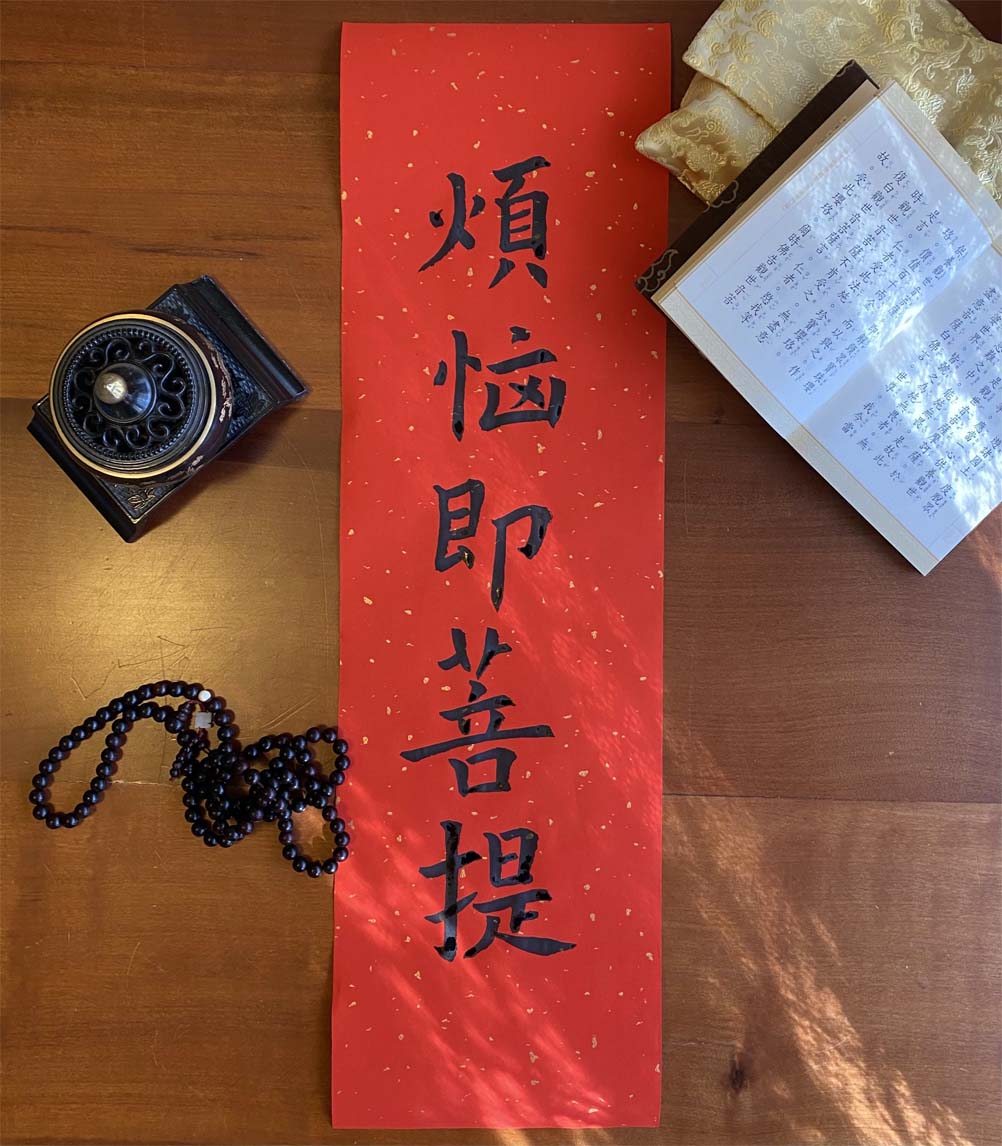
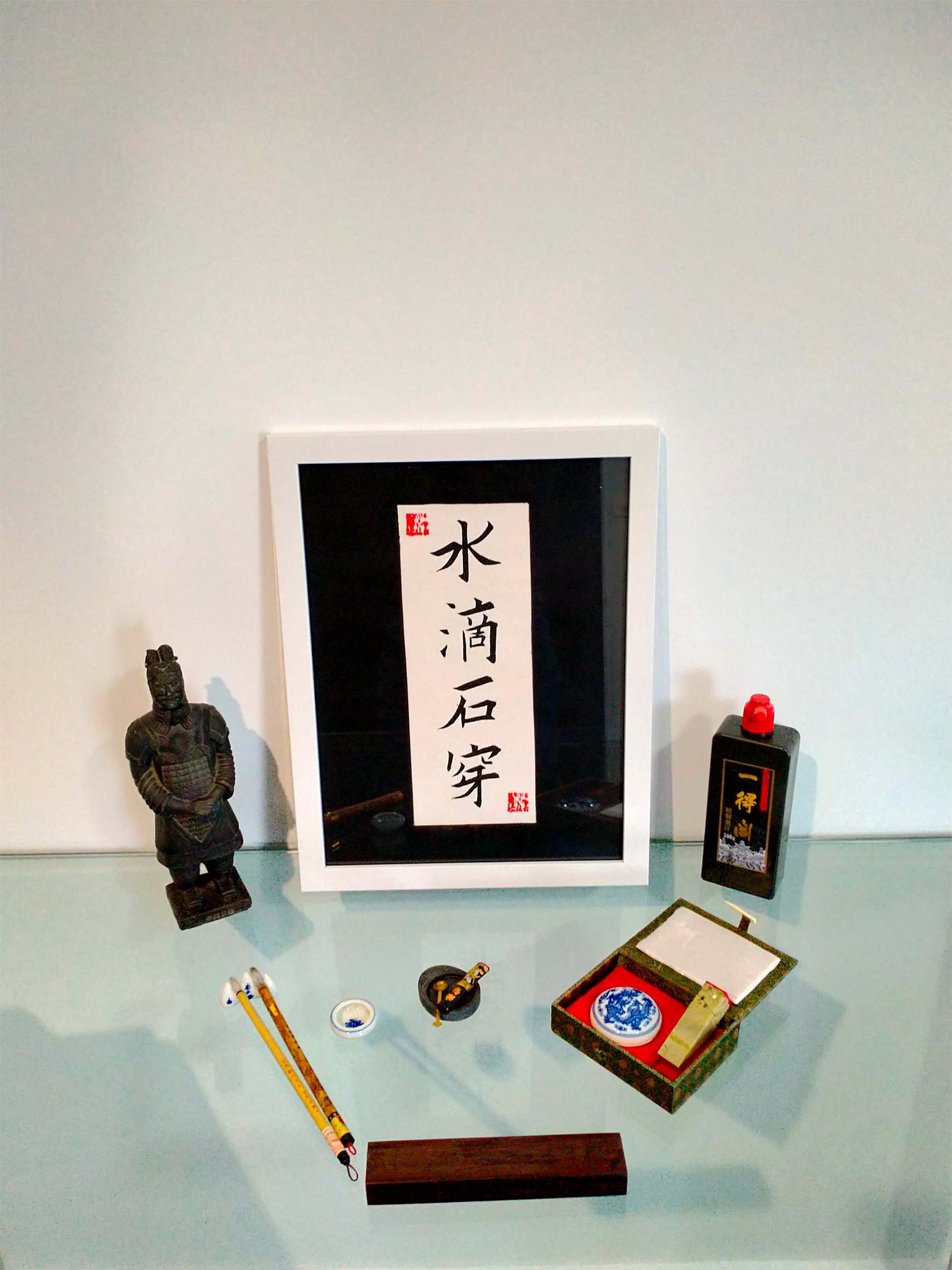
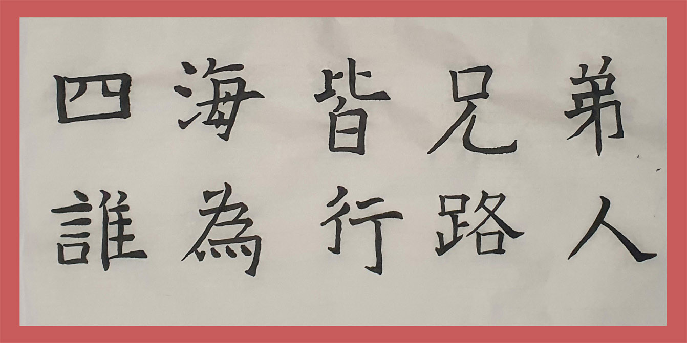
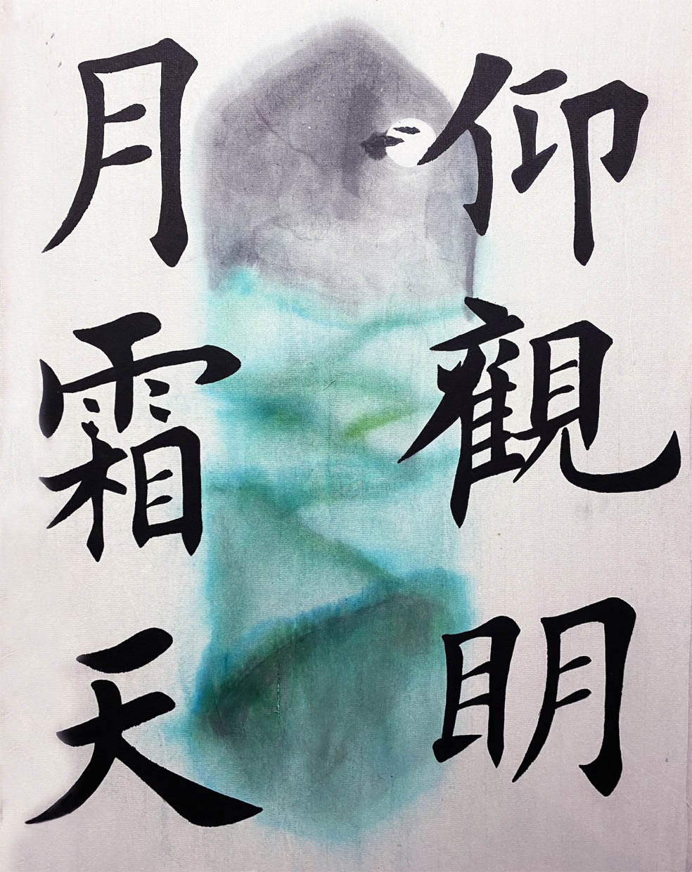
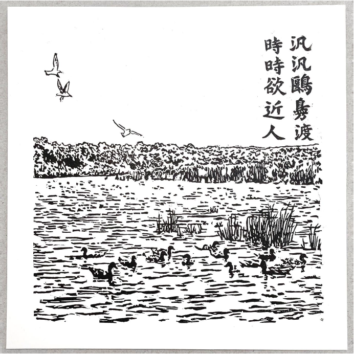
As my final project, I selected a poem from the Song Dynasty poet Zhang Lei (张耒). These two sentences were also developed into the later idiom "clean and spotless (纤尘不染)". I hope my life will not be affected by bad habits and secularised customs and become a person who insists on myself. for aesthetic purpose, I did not fold grids on top of the paper when I wrote these two sentences, so how to allocate the space for each word became a difficult aspect for the project. I learned calligraphy in China for two years off and on when I was in primary school, but after I came to Australia, I rarely touched the brush. I really cherish this opportunity as I could re-experience the charm of traditional Chinese calligraphy. In this unit, my biggest gain is the mastery of how to write "horizontal" and "tick". I occasionally copied the cursive writing of Tang Bohu and Song Huizong, so I usually did not pay much attention to the details of the strokes, either in daily writing or calligraphy. Through learning Ou style, I felt the importance of learning regular script and standardizing each stroke. In the future I will spend more time to correct my own writing deficiencies and improve the details of each stroke. I chose to write the phrase “烦恼即菩提” which roughly translates to “Vexations are Bodhi (enlightenment)”. I chose this phrase because that is what I feel Chinese calligraphy is like. You have a lot of mistakes and troubles while you’re doing it and you need to learn how to calm your mind in order to achieve the result that you want. In Chinese calligraphy you have to pay attention to the minor details of every character and it’s very hard to do that if your mind is scattered. So in order to achieve the outcome I may want I first practise letting go of that very same outcome. If I give rise to negative thoughts I treat them as the vexations that are teaching me and then put them aside. As I am buddhist, I feel that the art of Chinese calligraphy ties in with the mindfulness practice of meditation and because of this I treat the act of writing calligraphy as a religious practice. When I am experiencing vexations like shaky hands or my dog barking in the background or my inability to write a character the way I want, I reflect on these things and remember that this is a practice I am doing, not an outcome. This is an exercise I am conducting to calm my mind and my spirit and only through calming my mind and training it to tolerate the vexations of life can I achieve any worthy outcome. For my final calligraphy artwork I chose the Chinese idiom "Shui di shi chuan" which means " constant effort brings success". I came across this idiom while searching for inspiration for my project and immediately thought it was very fitting as it describes my journey of learning Chinese Calligraphy. When I first started the unit I found it very difficult and I felt quite tense. I was questioning whether or not this unit was suitable for me. I'm so glad I persevered. After a few weeks I started to find it very relaxing and enjoyable. The satisfaction that you get when you finally execute a good stroke or character is really a great feeling - I would often find myself spending 2-3 hours at a time practicing and trying to perfect my strokes. The time flew by! As the characters became more complex, the challenge got bigger as you might do 5 or 6 good strokes and then ruin the character on the final stroke. And then, putting several characters together presented an even greater challenge. I also had many difficulties with the process of mounting the artwork. For some reason this caused my artwork to smudge. So I created and mounted over a dozen pieces in order to get a couple of good ones. I will definitely keep practicing Chinese Calligraphy, and will be proudly hanging my final piece in my living room. Constant effort really does bring success! Ingrid Jukes. My exhibition piece is a Chinese proverb, 'All of us in the world are Brothers, even then the man who comes past as a traveller'. To me this stand for equalism and acceptance of all, no matter where one comes from, what one belives in, what cultural back ground they have or religious views and so on. I believe this to be something of importance in not Just Australia as a Multicultural country but throught the world. The inspiration for my final calligraphy artwork came from the accumulated knowledge of calligraphy that I have absorbed this trimester through Dr Shi Li’s instruction as well as the base line knowledge of Chinese culture I have picked up through years of Chinese language study and time spent in China. Chinese Western- Twine used in place of traditional mounting techniques While studying CHIN211, i was able to reflect on the unit and how studying calligraphy made me feel academically and emotionally. I was able to learn a calming sense of discipline, history and culture, and artistic values that I was never aware of prior. The inspiration of my calligraphy piece comes from the place I live, the Blue Mountains in New South Wales. My aim was to emphasis the importance and admiration i feel for the Blue Mountains. The beautiful sky and landscape is the focal point of the piece, with the words “仰观明 月霜天仰观明月霜天”/ Looking at the bright moon and frost sky. I dedicate this piece to my late mother, Helen. The calligraphy is written with calligraphy ink on xuan paper. I then traditionally mounted the piece, gluing a second piece of xuan paper to the back of the final calligraphy piece with a flour and water mixture. My artwork was inspired by part of a poem written by Pei Di. It reads: “泛泛鸥凫渡,时时欲近人。” which can be translated as, “The floating gulls and ducks come over (across the water), always wanting to be close to people.” I rolled ink onto the block (the ink stays on the uncarved surface), then placed paper (specially made for printmaking) on top. The ink on the block is transferred to the paper using an etching press. For my final Calligraphy piece, I have selected a line from the Ballad of 木兰辞 (Mulan): 何惧生死长物,一往前无 It comes from the final line where it asks whether in life or death, to not be deterred and to keep pressing forward. I really liked this line from the ballad as I felt I could relate to in a small way having experienced an injury which made completing this subject extremely difficult. I had some really difficult times, but because I enjoyed the pleasure of calligraphy and the mindfulness of meditative thinking while working, I decided to see this through to the end. I experimented with different options, testing different types of rice paper and experimenting with layers during the mount process, and also adjusting my ink to different consistencies to minimise ink run during the wet-mount. I opted for each of the hanzi to be drawn using custom mixed ink that I hand mixed myself. I mixed a combination of gold and black to give it distinction against the red backing, but to also introduce a pattern of metallic reflection when viewing the piece from different angles. These characters were presented on red rice paper filled with gold flecks, then mounted using traditional mounting paste (flour and water) on a more rigid Maobian Bamboo Paper to provide better structure. Once dried, they were then trimmed down to size, then mounted on a paper umbrella alongside the painting of Mulan that I worked on during the trimester.


My artwork is a fusion of Chinese and Western culture, taking elements of each and combining them to create a piece which is a direct reflection of my own experience.
Elements that highlight the individual cultures are:
- Vertically hung
- Chinese calligraphy techniques and characters
- Emphasis on the natural world
- High quality Chinese calligraphy ink and brush used
- Variety of handmade petal paper produced in WA
For each individual panel of the hanging piece, the paper selection was the most important part. Finding paper that best represented the individual seasons was critical to the overall experience had by the audience when viewing the artwork.
These techniques come together to produce a representation of myself and the skills I have developed through studying this unit.
I have thoroughly enjoyed studying calligraphy this trimester which has helped me further expand and deepen my understanding of China and Chinese culture and look forward to continuing to develop my techniques in the future.
I hope that you enjoy my final calligraphy artwork as much as I enjoyed producing it.
These words resonated with me, bringing back childhood memories of visiting my family on the Great Ocean Road in Victoria. We would walk along the river and feed the seagulls and ducks that swam over. It’s a beautiful place that I miss very much and think about often.
I decided to make my final calligraphy artwork a lino print, as it combines two of my interests – art and languages. I drew the illustration using a reference photo which I took during a past visit to family in Victoria. I chose traditional characters as I felt their aesthetic suited the overall composition.
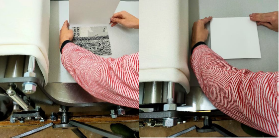
I then scanned it the image and used a computer to reverse it. This is an important step in printmaking – as shown in the picture below, the block must be carved in the reverse of what you want to appear on paper.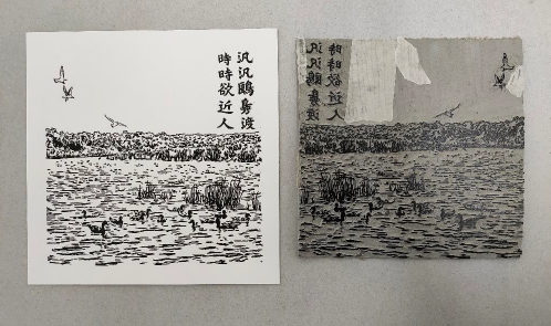
The paper measures 20 x 20cm and although carving at this size was quite a challenge, I can now use the block to print this artwork many times.